前言
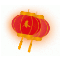
新年到了,过年挂灯笼是中国的一个习俗,家里挂灯笼,自己博客也是自己的家,当然也要挂一个了。很多年前 Flash 流行时,网上可以随便找一个 Flash 动画的灯笼,很方便就可以加到网站主题模板上,如今 Flash 已成过眼云烟,在国内甚至已变成流氓插件,这里网上找了知更鸟提供的 CSS3 代码动画灯笼,将灯笼挂在自己的博客上,增加点过年的气氛。
效果如图:
![图片[1] - #教程# 迎新年 网站挂“春节”灯笼代码 - 云线路](/wp-content/uploads/2020/01/2020012304305215.gif)
使用方法
第一步、添加 HTML 代码
将下面的 HTML 代码添加到主题页脚模板 footer.php,标签的上面。
<div class="deng-box">
        <div class="deng">
                <div class="xian"></div>
                <div class="deng-a">
                        <div class="deng-b"><div class="deng-t">旦</div></div>
                </div>
                <div class="shui shui-a"><div class="shui-c"></div><div class="shui-b"></div></div>
        </div>
</div>

<!-- 灯笼 2 -->
<div class="deng-box1">
        <div class="deng">
                <div class="xian"></div>
                <div class="deng-a">
                        <div class="deng-b"><div class="deng-t">元</div></div>
                </div>
                <div class="shui shui-a"><div class="shui-c"></div><div class="shui-b"></div></div>
        </div>
</div>
因为代码中有中文,编辑后需要将模板文件保存为 UTF-8 无 BOM(无签名)的格式,后台主题编辑中修改可以忽略,上面的代码可以只加一个,个人感觉挂两个灯笼更灵动些。
第二步、添加样式
将样式代码添加到 WP 后台 → 外观 → 自定义 → 额外 CSS 中,点击“发布”即可
.deng-box {
        position: fixed;
        top: -40px;
        right: -20px;
        z-index: 9999;
        pointer-events: none;
}

.deng-box1 {
        position: fixed;
        top: -30px;
        right: 10px;
        z-index: 9999;
        pointer-events: none;
}
.deng-box1 .deng {
        position: relative;
        width: 120px;
        height: 90px;
        margin: 50px;
        background: #d8000f;
        background: rgba(216, 0, 15, 0.8);
        border-radius: 50% 50%;
        -webkit-transform-origin: 50% -100px;
        -webkit-animation: swing 5s infinite ease-in-out;
        box-shadow: -5px 5px 30px 4px rgba(252, 144, 61, 1);
}
.deng {
        position: relative;
        width: 120px;
        height: 90px;
        margin: 50px;
        background: #d8000f;
        background: rgba(216, 0, 15, 0.8);
        border-radius: 50% 50%;
        -webkit-transform-origin: 50% -100px;
        -webkit-animation: swing 3s infinite ease-in-out;
        box-shadow: -5px 5px 50px 4px rgba(250, 108, 0, 1);
}
.deng-a {
        width: 100px;
        height: 90px;
        background: #d8000f;
        background: rgba(216, 0, 15, 0.1);
        margin: 12px 8px 8px 10px;
        border-radius: 50% 50%;
        border: 2px solid #dc8f03;
}
.deng-b {
        width: 45px;
        height: 90px;
        background: #d8000f;
        background: rgba(216, 0, 15, 0.1);
        margin: -2px 8px 8px 26px;
        border-radius: 50% 50%;
        border: 2px solid #dc8f03;
}
.xian {
        position: absolute;
        top: -20px;
        left: 60px;
        width: 2px;
        height: 20px;
        background: #dc8f03;
}
.shui-a {
        position: relative;
        width: 5px;
        height: 20px;
        margin: -5px 0 0 59px;
        -webkit-animation: swing 4s infinite ease-in-out;
        -webkit-transform-origin: 50% -45px;
        background: #ffa500;
        border-radius: 0 0 5px 5px;
}
.shui-b {
        position: absolute;
        top: 14px;
        left: -2px;
        width: 10px;
        height: 10px;
        background: #dc8f03;
        border-radius: 50%;
}
.shui-c {
        position: absolute;
        top: 18px;
        left: -2px;
        width: 10px;
        height: 35px;
        background: #ffa500;
        border-radius: 0 0 0 5px;
}
.deng:before {
        position: absolute;
        top: -7px;
        left: 29px;
        height: 12px;
        width: 60px;
        content: " ";
        display: block;
        z-index: 999;
        border-radius: 5px 5px 0 0;
        border: solid 1px #dc8f03;
        background: #ffa500;
        background: linear-gradient(to right, #dc8f03, #ffa500, #dc8f03, #ffa500, #dc8f03);
}
.deng:after {
        position: absolute;
        bottom: -7px;
        left: 10px;
        height: 12px;
        width: 60px;
        content: " ";
        display: block;
        margin-left: 20px;
        border-radius: 0 0 5px 5px;
        border: solid 1px #dc8f03;
        background: #ffa500;
        background: linear-gradient(to right, #dc8f03, #ffa500, #dc8f03, #ffa500, #dc8f03);
}
.deng-t {
        font-family: 华文行楷,Arial,Lucida Grande,Tahoma,sans-serif;
        font-size: 3.2rem;
        color: #dc8f03;
        font-weight: bold;
        line-height: 85px;
        text-align: center;
}
.night .deng-t,
.night .deng-box,
.night .deng-box1 {
        background: transparent !important;
}
@-moz-keyframes swing {
        0% {
                -moz-transform: rotate(-10deg)
        }
        50% {
                -moz-transform: rotate(10deg)
        }

        100% {
                -moz-transform: rotate(-10deg)
        }
}
@-webkit-keyframes swing {
        0% {
                -webkit-transform: rotate(-10deg)
        }
        50% {
                -webkit-transform: rotate(10deg)
        }
        100% {
                -webkit-transform: rotate(-10deg)
        }
}
也可以将样式代码直接加到主题样式文件 style.css 的最后。可能灯笼上的文字字号在有些主题上有点大,可以适当修改第 124 行的字号:
font-size: 3.2rem;如果只想在首页显示灯笼,可以用下面的判断语句把上面的代码包裹起来:
<?php if (is_home()) { ?>
<!-- 代码放这里 -->
<?php } ?>
代码在手机上显示效果不是很好,如果不想在手机上显示可以在自定义代码添加:
@media screen and (max-width: 550px) {
.deng {
        display: none;
}
deng-box {
        display: none;
}
.deng-box1 {
        display: none;
}
}
添加梅花背景
将下面的 HTML 代码添加到主题页脚模板 footer.php,灯笼代码的上面
<div class="meiha"></div>添加 CSS
将样式代码添加到 WP 后台 → 外观 → 自定义 → 额外 CSS 中,点击“发布”即可
/** 梅花树 **/
.meiha {
        position: fixed;
        top: 0;
        right: 0;
        z-index: 999;
        width: 350px;/** PNG 图宽度 **/
        height: 231px;/** PNG 图高度 **/
        pointer-events: none;
        background: url('https://missuo.ru/file/264aacc09fb6c57a1bb05.png');
}
如果只想显示在首页,可以用下面的判断语句把上面的代码包裹起来:
<?php if (is_home()) { ?>
<!-- 代码放这里 -->
<?php } ?>
直接放在 footer.php
<!-- 春节灯笼[灯笼]代码 -->
<?php if (is_home()) { ?>
<div class="meiha"></div>
<style>
/** 梅花树 **/
.meiha {
        position: fixed;
        top: 0;
        right: 0;
        z-index: 999;
        width: 330px;/** PNG 图宽度 **/
        height: 200px;/** PNG 图高度 **/
        pointer-events: none;
        background: url('https://missuo.ru/file/264aacc09fb6c57a1bb05.png');
}
@media screen and (max-width: 500px) {
.meiha {display:none;}
}
</style>

<!-- 灯笼 1 -->
<div class="deng-box">
        <div class="deng">
                <div class="xian"></div>
                <div class="deng-a">
                        <div class="deng-b"><div class="deng-t">节</div></div>
                </div>
                <div class="shui shui-a"><div class="shui-c"></div><div class="shui-b"></div></div>
        </div>
</div>

<!-- 灯笼 2 -->
<div class="deng-box1">
        <div class="deng">
                <div class="xian"></div>
                <div class="deng-a">
                        <div class="deng-b"><div class="deng-t">春</div></div>
                </div>
                <div class="shui shui-a"><div class="shui-c"></div><div class="shui-b"></div></div>
        </div>
</div>
<style>
.deng-box {
        position: fixed;
        top: -40px;
        right: -20px;
        z-index: 9999;
        pointer-events: none;
}

.deng-box1 {
        position: fixed;
        top: -30px;
        right: 10px;
        z-index: 9999;
        pointer-events: none;
}
.deng-box1 .deng {
        position: relative;
        width: 120px;
        height: 90px;
        margin: 50px;
        background: #d8000f;
        background: rgba(216, 0, 15, 0.8);
        border-radius: 50% 50%;
        -webkit-transform-origin: 50% -100px;
        -webkit-animation: swing 5s infinite ease-in-out;
        box-shadow: -5px 5px 30px 4px rgba(252, 144, 61, 1);
}
.deng {
        position: relative;
        width: 120px;
        height: 90px;
        margin: 50px;
        background: #d8000f;
        background: rgba(216, 0, 15, 0.8);
        border-radius: 50% 50%;
        -webkit-transform-origin: 50% -100px;
        -webkit-animation: swing 3s infinite ease-in-out;
        box-shadow: -5px 5px 50px 4px rgba(250, 108, 0, 1);
}
.deng-a {
        width: 100px;
        height: 90px;
        background: #d8000f;
        background: rgba(216, 0, 15, 0.1);
        margin: 12px 8px 8px 10px;
        border-radius: 50% 50%;
        border: 2px solid #dc8f03;
}
.deng-b {
        width: 45px;
        height: 90px;
        background: #d8000f;
        background: rgba(216, 0, 15, 0.1);
        margin: -2px 8px 8px 26px;
        border-radius: 50% 50%;
        border: 2px solid #dc8f03;
}
.xian {
        position: absolute;
        top: -20px;
        left: 60px;
        width: 2px;
        height: 20px;
        background: #dc8f03;
}
.shui-a {
        position: relative;
        width: 5px;
        height: 20px;
        margin: -5px 0 0 59px;
        -webkit-animation: swing 4s infinite ease-in-out;
        -webkit-transform-origin: 50% -45px;
        background: #ffa500;
        border-radius: 0 0 5px 5px;
}
.shui-b {
        position: absolute;
        top: 14px;
        left: -2px;
        width: 10px;
        height: 10px;
        background: #dc8f03;
        border-radius: 50%;
}
.shui-c {
        position: absolute;
        top: 18px;
        left: -2px;
        width: 10px;
        height: 35px;
        background: #ffa500;
        border-radius: 0 0 0 5px;
}
.deng:before {
        position: absolute;
        top: -7px;
        left: 29px;
        height: 12px;
        width: 60px;
        content: " ";
        display: block;
        z-index: 999;
        border-radius: 5px 5px 0 0;
        border: solid 1px #dc8f03;
        background: #ffa500;
        background: linear-gradient(to right, #dc8f03, #ffa500, #dc8f03, #ffa500, #dc8f03);
}
.deng:after {
        position: absolute;
        bottom: -7px;
        left: 10px;
        height: 12px;
        width: 60px;
        content: " ";
        display: block;
        margin-left: 20px;
        border-radius: 0 0 5px 5px;
        border: solid 1px #dc8f03;
        background: #ffa500;
        background: linear-gradient(to right, #dc8f03, #ffa500, #dc8f03, #ffa500, #dc8f03);
}
.deng-t {
        font-family: 华文行楷,Arial,Lucida Grande,Tahoma,sans-serif;
        font-size: 3.2rem;
        color: #dc8f03;
        font-weight: bold;
        line-height: 85px;
        text-align: center;
}
.night .deng-t,
.night .deng-box,
.night .deng-box1 {
        background: transparent !important;
}
@-moz-keyframes swing {
        0% {
                -moz-transform: rotate(-10deg)
        }
        50% {
                -moz-transform: rotate(10deg)
        }

        100% {
                -moz-transform: rotate(-10deg)
        }
}
@-webkit-keyframes swing {
        0% {
                -webkit-transform: rotate(-10deg)
        }
        50% {
                -webkit-transform: rotate(10deg)
        }
        100% {
                -webkit-transform: rotate(-10deg)
        }
}
@media screen and (max-width: 500px) {
.deng {
        display: none;
}
deng-box {
        display: none;
}
.deng-box1 {
        display: none;
}
}
</style>
<?php } ?>
<!-- end -->
总结
好了,到这里就愉快的结束了,尽情享受过年的气氛吧!
© 本站文章随意转载,但请注明出处!
>> 如果您觉得本站文章对您有所帮助,购买 VPS 时候请走本站AFF链接!
>> 某些文章具有时效性,若内容有错误或已失效,欢迎在下方评论区留言向我们反馈.
>> 所有文章均基于分享的原则,所有言论均个人观点,请注意全部都不是推荐,是分享!分享!分享!
>> 所有文章均基于分享的原则,所有言论均个人观点,请注意全部都不是推荐,是分享!分享!分享!
THE END


暂无评论内容